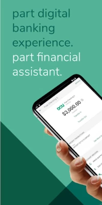

DCU Digital Banking
August 17, 2024More About DCU Digital Banking
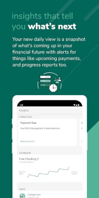
• FutureLook™ helps you see into your financial future with an easy-to-read forecast based on your current choices.
• Our easy-to-use Payment Planner can help you pay off your loans even faster.
• You can create strategic financial goals and review your progress every step of the way.
STREAMLINE MONEY MANAGEMENT
Explore new ways to manage your money and achieve financial wellness.
• Holistic view of your finances.
• All of your accounts in one place – including ones at other financial institutions.
• Seamless payments.
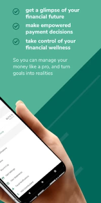
With a unique-to-you digital banking experience that focuses on your money’s future, you can plan for whatever life throws your way. DCU Digital Banking is here to give you financial peace of mind.
---
FUTURELOOK™
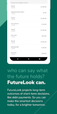
FutureLook™ provides insight into your spending habits with an easy-to-read forecast based on your current choices. You’ll be able to answer simple questions about what you can afford and see the potential benefit of paying more towards your loans and/or credit cards – in real time.
Specifically, FutureLook™ identifies your recurring income (e.g., paychecks), recurring expenses (e.g., electric bill), and average daily spending (e.g., the morning coffee run). By doing so, you can see your estimated checking account balance one month into the future (on a daily basis) and one year into the future (on a monthly basis).
All in all, FutureLook™ is a unique tool that helps you see how your money could better serve you.
PAYMENT PLANNER
Our easy-to-use payment planner will help answer questions like:
• “If I paid more on my auto loan, how much interest would I save?”
• “If I only make the minimum payment, when will I be debt-free?”
• “How quickly can I pay off my loan?”
GOALS
We make it easy to focus on your life goals with a digital banking experience that was designed for you. You can create strategic financial goals and review your progress every step of the way. No matter what you’re saving money for, we can help you create a personalized action plan that works for you.
OTHER STANDARD FEATURES
- Manage Quick Balance accounts
- Find branches and ATMs nearby
- Deposit Checks*
- View balances, current and pending transactions, and account history
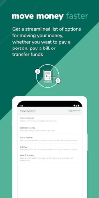
- Transfer funds
- Pay Bills
- Make a loan payment
- View important messages and account alerts
- Update your contact information
- Add Travel Notifications to avoid unnecessary fraud alerts while you’re away
- Apply for loans and view your preapproval offers
- Make a balance transfer to your DCU Visa Platinum Card
*Upon approval. All deposits are subject to DCU’s Funds Availability Policy.
Latest Version
2.11.0-dcu
August 17, 2024
Digital Federal Credit Union
Finance
Android
464,487
Free
com.projectfinance.android.dcu
Report a Problem
User Reviews
Dillon
3 years ago
The old app was way more user friendly. This new app is way more clunky, less intuitive and the design is terrible. I wish I could say the website was better but it is just as awful. I use a variety of financial institutions and there was nothing wrong with the way DCU had it before. Now it's bottom of the barrel, which is disappointing.
Roy Lavender
3 years ago
DCU had a nice working app but insisted on making a new one anyway. Of course the customer has no say in the matter. This new app is terrible. While the look and feel is slightly more modern, everything you want to do is poorly designed. It's not a matter of learning a new interface, I "can" do what I want, it is just a terrible user experience, multiple clicks on multiple menus to accomplish things that used to be much simpler. DCU, why spend all this money to make your product worse?
Y Cherio
3 years ago
Can the welcome screen be more useful e.g. have account summary list or be a navigation hub as dashboards supposed to be? The app feels raw, it kicked me out a few times and back button behavior is erratic sometimes. On the positive side it looks functionally richer and more consistent with the new web interface. You are on the right track. I'll change to 5 stars when bugs are fixed.
Anat Engel
3 years ago
DCU new updated system is horrible!!! Online and on the mobile App. I just hate it!!! Not a friendly user. tried to use it on my phone After I updated the App, I just now checked my accounts' recent transactions. After each transaction the new balance is suppose to be posted. It was posted but only the first 3 digits. This is a slap on customers' faces !!! Considering moving my my Banking to another bank. Their loss!!!
Lisa Chouinard
3 years ago
PLEASE BRING BACK THE WIDGET! Having a quick view of my balances at all times was like a security blanket, I always knew what was going on with my accounts up to the minute. I don't stay logged into the app on my phone for security reasons and it's a pain to have to log into my account for this every time when I just want to view this quick info. The app itself is ok, no great improvements I can see over the last one.
John Vines
3 years ago
I have no idea why there is a new app that's a worse experience. You open it up and you get brought to a stark page that asks you to link accounts with plaid, set up some future account estimator, and an ask to set up goals. If you scrolled down trying to find the basic thing like account balances, the navigation bar vanishes, leaving you on this empty page that makes you wonder if it even belongs with a bank. And there's no way to change the landing page to accounts, which is all I want.
Kee Chan
3 years ago
After more than two weeks of using this "new" app, I don't see any improvement at all. As a matter of fact, it is a degradation. The response time is so much slower than the old app, it is almost not acceptable! The dashboard which is the first screen after login is useless with no value to the user. A complete disappointment that was forced to the user with no alternative.
Chrissy
3 years ago
The last app was so much more convenient. This one loads incredibly slow in comparison. I was told they made a new one to make the website features all available on the app, but it takes forever to find anything anyway, so the website was easier. Documents also don't download/load properly so you have to go on the site anyway. The way to set up checking/savings transfers is tedious for no reason. Hate it.
Michael D'Agostino
3 years ago
DCU what happened? This new app is terrible. While I love DCU as a bank, credit union, and loan provider, this new app is hot garbage. It looks so much worse than the old app; like an Excel sheet from the 80's. It also loads so much slower than the old app. Paying a bill takes several more clicks and a whole lot more time. Maybe the security is better or there is some benefit I can't see, but I feels a whole lot like no one used this app before releasing it.
Mike
3 years ago
The old app was fine. This is an absolute downgrade. Why would you get rid of the widget?!? All I need from a banking app on my phone is a quick glimpse at my financial situation atm which I used to have. Now I have to open the app and navigate to the accounts screen which isn't set by default because some brainless programmer decided to make the default screen completely useless garbage for the day to day user. Yes, it's only 30 seconds difference but everything I needed was right there and now that's been taken from me. Also consider the reported issues with deposits I have yet to try and you have yourself a mess of a so-called upgrade. I am considering using a new checking account as there are other options out there that offer extremely basic but extremely useful tools such as the widget.
Rebecca Gallo
2 years ago
Terrible. Since the 'new' app I can't transfer or send money on mobile at all - the screens just don't load. On the old app I never had to log on w my PC, but that's the new standard. This app is JUNK. Edit: uninstalling and reinstalling worked! Not sure why the app didn't just update, but happy to have full functionality again.
Kayla Reade
3 years ago
The new app is horrible! I think the worst thing about it for me is the people pay. My fiance and I used it on the old one all the time with no issue and now it's horrible. Having to re-enter all of our contacts (which we were told would be transferred over) was annoying but not a deal-breaker. The deal-breaker for me is the fact that you can no longer transfer money the same day to someone, or EVEN the next day. Who is transferring money 3 days from when they send it?
Susan Turcotte
3 years ago
Worst app ever. Can't find Bill Pay, no calculator, worst is that I have to disable my VPN! Then when I toggle between this and my credit card I have to enable mine everytime I compare the two. Awful now takes long time to check on statements. Before it was quick and easy. I will probably move my money to different bank. I don't have time for all this back and forth. You truly missed the mark on this one
A Kelly
3 years ago
**Tip- my username was my 7 digit acct #.** I added my other bank acct. It asked primary so I chose checking. I only see that added. Because it's not primary the savings doesn't get added? No totals either. It's a pain to add my other accts and now I don't see the point. I agree with others, the landing page should be accounts. I don't like the look of my Dark theme in it and everything is thrown together, casual and disorganized. For a digital credit union, this online experience is lacking.
Brian Merritt
3 years ago
As of May 2022. They 'upgraded' the app recently, effectively putting makeup on a dud. Everything looks nice and pretty but is harder to find. Expect to stumble around blindly clicking on random things until you happen on what your wanted. The 'search' transactions function will pull literally all transactions, ignoring whatever search term you entered. Good luck!
Paul Grillo
3 years ago
This replacement is horrible. In addition to the overall bad interface, I'm unable (I think ... which is the worse part) to deposit a check. It continually ignores the picture of the back of the check - it then tells me it is accepted and go look. I go look, and no money is there - and I don't even get an email indicating a successful deposit. So .. now what. When a company says they are replacing their interface with a new and improved one - it means they are saving money buy replacing it with a worse version
Jason Maguire
2 years ago
ZERO STARS. The new app is junk. It's slow, it's missing functionality, and everything takes 3 more steps than it used to! They clearly went with the lowest bid on this and it looks like the bill pay is going through a third party now. This new bill pay is mailing checks instead of electronic payment. Coupled with mail issues it equals late payments! If the goal was to alienate members by making online banking more difficult, they have succeeded. Time to find a new credit union!
ron james
3 years ago
You would never know this company was the namesake of one of the most innovative computer companies in the history of computing. The software stack and GUI implementation is one of the worst I have ever seen and have been in the software/hardware industry for 45 years. Too many issues to even get in to. The executable file on the pc is even worse. You do not have load balancing on the server side which results in slower page load. So many pages to scroll through to get to information you need.
David Greenlaw
1 year ago
Coming from New England and a business environment I find that change is not easily accepted especially with software. The only addition, which I hope is coming, is bringing back the widget and the quick balance in some way shape or form, as it is quite handy. Edit3/10/24--Widget is working, but cannot find a way to edit which accounts appear in it anymore.
Ally
1 year ago
This app has gotten better but it's not even close to the previous app. My biggest issue now is the custom notifications just do what they want. I don't get notified instantly for a deposit like I did before. I'm also getting notified annoyingly every day (of my balance) instead of the once-a-week I requested. Idk if the text functions work anymore, but I can't use them since this new app. (For Ex:BAL ALL). Unfortunately, the reps I call can't do anything to help. No technical support? Cmon DCU?
