

Syfe: Stay Invested
August 19, 2024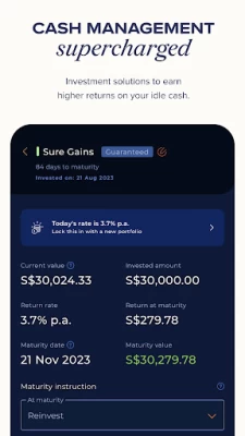
More About Syfe: Stay Invested
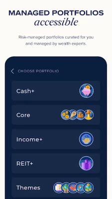
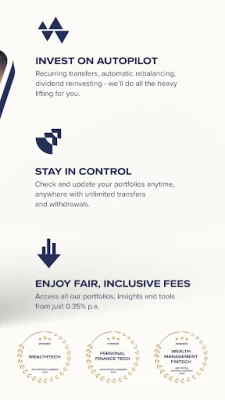
MANAGED PORTFOLIOS
Whether you want to invest for growth or income, we have comprehensive solutions for all. Our portfolios are curated by investment experts. Leave the heavy lifting to us! From fund selection, reinvesting dividends to rebalancing your portfolios and more.
Portfolio Highlights
• Core - Choose preferred allocations of equities, bonds and commodities based on your investment horizon and risk appetite
• Income+ - Generate passive income. Get paid directly to your bank account. A fixed income solution powered by PIMCO
• REIT+ - Invest for growth and income in Singapore’s real estate market. Access top 20 quality S-REITs in one portfolio.
• Themes & Custom - Express your views on the world with investments aligned to your conviction
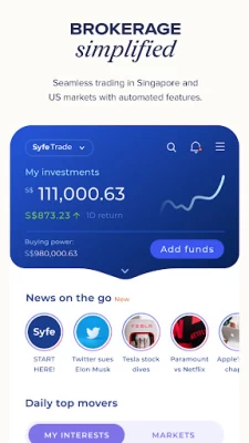
BROKERAGE (Only Available in SG and AU)
Simplified and a seamless way to trade your favourite Singapore and US stocks, ETFs, and REITs. Discover, automate and be in control of your investments at all times.
Feature Highlights
• Free trades on US stocks every month and low fees for SG stocks with no platform or hidden fees.
• Fractional trading- buy US stocks or ETFs at any amount you want, starting with as little as US$1
• Simplified experience with access to real-time market data
• Safe & secure - Syfe has bank-grade security with MFA and individual accounts are protected up to $500k.
CASH MANAGEMENT
Supercharge your savings with Cash+ the way you want. Flexible or fixed, it’s up to you. Earn higher returns on your cash savings with a low-risk, cash management solution.
Portfolio Highlights
• Flexi - Go with the flow with money market returns, maintain that option to withdraw funds quickly at any time
• Guaranteed - Fix your returns, lock that capital in at an optimised rate
REACH OUT TO US
Syfe Singapore
- MAS Capital Markets Services License - CMS100837
- Address: 4 Robinson Rd, #11-01 The House Of Eden, Singapore 048543
- Email: support.sg@syfe.com
- Call us at +65 3138 1215 9:00 and 6:00 Monday - Friday
Syfe Hong Kong
- Securities and Futures Commission CE No. BRQ741
- Address: 12102, 10/F, YF Life Tower, 33 Lockhart Road, Wanchai, Hong Kong
- Email: support.hk@syfe.com
- Call us at +852 2833 1017 9:00 and 6:00 Monday - Friday
Syfe Australia
- CAR (1295306) of Sanlam Private Wealth Pty Ltd (AFSL 337927)
- Address: Level 19, 180 Lonsdale Street, Melbourne VIC 3000
- Email: support.au@syfe.com
- Call us at 1800 577 398 9:00 and 6:00 Monday - Friday
Latest Version
11.4.1
August 19, 2024
Syfe Pte. Ltd.
Finance
Android
218,331
Free
com.syfe
Report a Problem
User Reviews

Ming Zhang
1 year ago
new UI is so so bad. unable to see my monthly profit/loss in brokerage account anymore and unable to track progress of my investment portfolio

Jacob Lee
1 year ago
Poor customer service. Do not recommend. Will be withdrawing my funds from this platform. Opened a ticket for around 2 weeks now and have not received a useful reply. Opened another ticket and still waiting to hear back from them. Can you imagine placing your money with such a platform? Edit: 3 weeks now. Nice.

Ace F.
1 year ago
Customer service is absolutely trash, does not listen to instructions and cannot answer basic questions. Customer service is the worst in the industry. DO NOT RECOMMEND

Meng Liang Tan
1 year ago
Utility wise no problem. Just want to ask for the options to change font size or allow the phone settings to overwrite font settings. The fonts are way too small for aging eyes. Thanks!

Yun Ting Peng
1 year ago
the new UI for trade is terrible. many things are hard to find, the older UI was much simpler.

Victor D
1 year ago
The application improved a lot. Communications are lesser but more effective. I would appreciate having in-app past performances insights for the portfolios. For instance giving me insights on why my Tech Bet on AI, Batteries or Cloud is not performing as well. Stashaway does have that for portfolios and it's helpful. Syfe tends to share insights by emails, however the content would be better in-app in each portfolio, I often skip those emails because not the right time to read, or too general.

Kamal Halim
1 year ago
Yep the new app is terrible. Im looking at withdrawing my funds soon. CS is also very argumentative rather than helping. Withdrawing funds also takes very long.

Joshua Lee
1 year ago
Hate the new UI. Old one with the graph was way better. (25 June) Devs updated on the future plans and I'm thankful for feedback.

Eddie Goh
1 year ago
Graphs can be more interactive with zoom in and out. What I hate is their auto deposit, for 2 times there's delay of deposits shown in my account. Although this was solved with transaction screenshots to the CSOs, it's very annoying to the extend that I ditch the auto deposit and manually transfer, which is even faster.

Hugo
1 year ago
Most recent update broke how the total returns is calculated. When a portfolio expires, and the profit is transferred back to bank, the total returns can drop! Update: Fixed

sumarni mohamed yusoff
1 year ago
This new update totally just spoiled it. Where is the graph to show the growth of portfolio. For every update it feels so much downgrade. Please review and consider inputting the graph back on. Re-edit review cos graph is back!! Thank you

Ashley Koh
1 year ago
Is there a way I can roll back to the previous version? Font size for the current brokerage version is way smaller and harder to see. Prefer the simplicity and larger font/ simpler layout of the old UI.

Adeel Kasban
1 year ago
New Trade UI sucks.... Can't see everything I need in a glance unlike the previous UI, only shows 3 holdings ??? Then I have to "view all", to see my unrealised returns need to tap in more again....

EnvyPride
1 year ago
Been using syfe for many years now. But got to say the new UI sucks so bad. Please change it back to the old one with the chart. For overall p&L Edit: thanks for putting the chart back! It's way better now!

Kian Hui Tan
1 year ago
Been using syfe for a couple of years now. They give me the best value when trading US stock and HK exchange is a welcoming addition but i wish they can focus on trading features or risk management features like differnent kinds of stop lost instead of making UI improvement which i feel are less valuble. Pls bring back the portfolio button, why would the UX UI designer take away the fastest option to see my portfolio which is the first thing any user would do upon entering the app.

QJ Lim
1 year ago
Visually looks attractive and works well for the most part, but dissapointing experience for simple QoL features such as: modifying existing alerts for Brokerage (why do i need to look through all my alerts to identify that alert to modify for the listing page I just navigated from?); and viewing cash management portfolios (seemingly no logical order of my portfolios; difficult to see which ones mature first).

Tsu Hsien Chan
1 year ago
All in all a great app to use to purchase stocks. But it will be great if they can do a roll back and show the line chart of your wealth movement on a daily weekly again. I find it helpful to just have a rough gauge of your performance. Without it feels weird.

Jonathan tztztztztt
1 year ago
Does the job, but there is room for improvement. Improve UI (something off about the font, colour choices and general design - some areas taking up more space than they need to), add charts to track our total capital from start to current day. Add more markets. In general, keep the currently available stats, and make a few adjustments. Simple with important stats, not unecessary 'features'. UPDATE: Oh and I much prefer the older UI instead of the recent new one. It just seems messy.

Lee De Kai
1 year ago
Have been using Syfe for more than a year now and just updated the app and got a shock from the brokerage UI, too white, no longer seeing the red/green profit losses and is just to put nicely, not nice anymore. Please revert back to the old UI or I may have to consider other brokers... Edit: have also been suggesting new features like premarket movements, dark mode etc but i guess nothing has really been done oh wells

Timothy Loh
1 year ago
Unable to withdraw cash in USD to a USD account. They want to only exchange it to SGD before withdrawal so they can earn more through the lousy rates they provide. Stay away from US or other foreign currency trades on the platform. Edit: SYFE reached out and corrected the mistake made for my USD withdrawal to a USD account. It was a big hassle but at least it was rectified. 5 stars for the effort. There is still no transparency on how much the bank charges are though, something to improve.